Election 2024
Widget
→ Overview
Election night moves in stages.
Polls close. Partial results come in. Races get called. A winner is declared. Readers want to follow along without opening an app every few minutes.
The Election 2024 Widget delivered live results across three iPhone surfaces: the Lock Screen, Dynamic Island Compact, and Dynamic Island Expanded. Glanceable, real-time, and clear about what was still unknown.
→ The Problem
Traditional election coverage was not built for widgets.
The Lock Screen, Dynamic Island Compact, and Dynamic Island Expanded each demand quick, glanceable information. Not full pages. Not dense charts. Readers wanted to see who was ahead, what had been called, and what was still counting, without opening the app.
The widget also needed to hold up across the full arc of election night. Early returns. Partial results. Uncalled races. Final declarations. Each stage carried different information and a different level of certainty.
→ Comparative Analysis
Reference: NBC, NYT, AP, Glimpse, Brazilian election widgets.
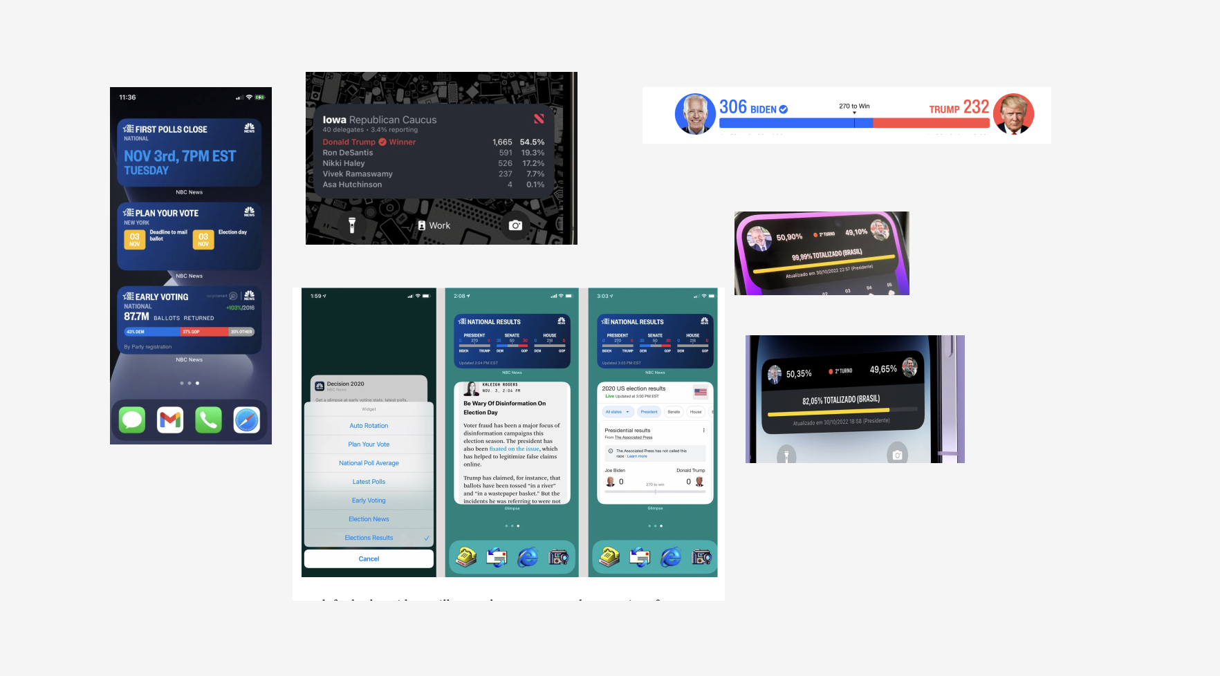
I looked at how other publishers had handled the format. NBC's widgets used a stacked, at-a-glance approach for polls closing, voting deadlines, and ballot returns. The NYT ran an Iowa Caucus widget with candidate order and vote percentages, but no context on what was still counting.
Third-party apps like Glimpse offered configurable views: auto-rotation, national poll averages, latest polls, election news. Flexible, but noisy. AP embedded results inside articles rather than as a standalone widget.
Brazilian election coverage stood out. Full-screen Dynamic Island takeovers with candidate portraits, live percentages, and a total-counted progress bar. The clearest example of election data working at Dynamic Island scale.
Two patterns emerged from the review. The best widgets showed live percentages with a clear sense of how much data was in. The weakest ones treated widgets as smaller versions of desktop coverage.
The starting point: build for the format, not around it.
→ Explorations
Two threads: widget states across election night, and how the Dynamic Island should behave.
→ Widget States
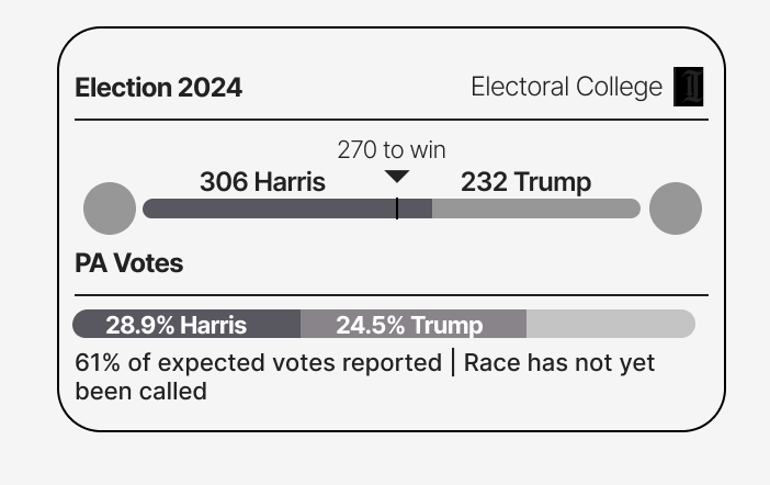
I mapped every stage of an election night as a distinct widget view. No votes counted yet. Partial results, race not called. Electoral majority reached. Final winner declared.
Each state needed its own visual language. What's a leading candidate? What's a called race? What's uncertain?
→ Dynamic Island Behavior
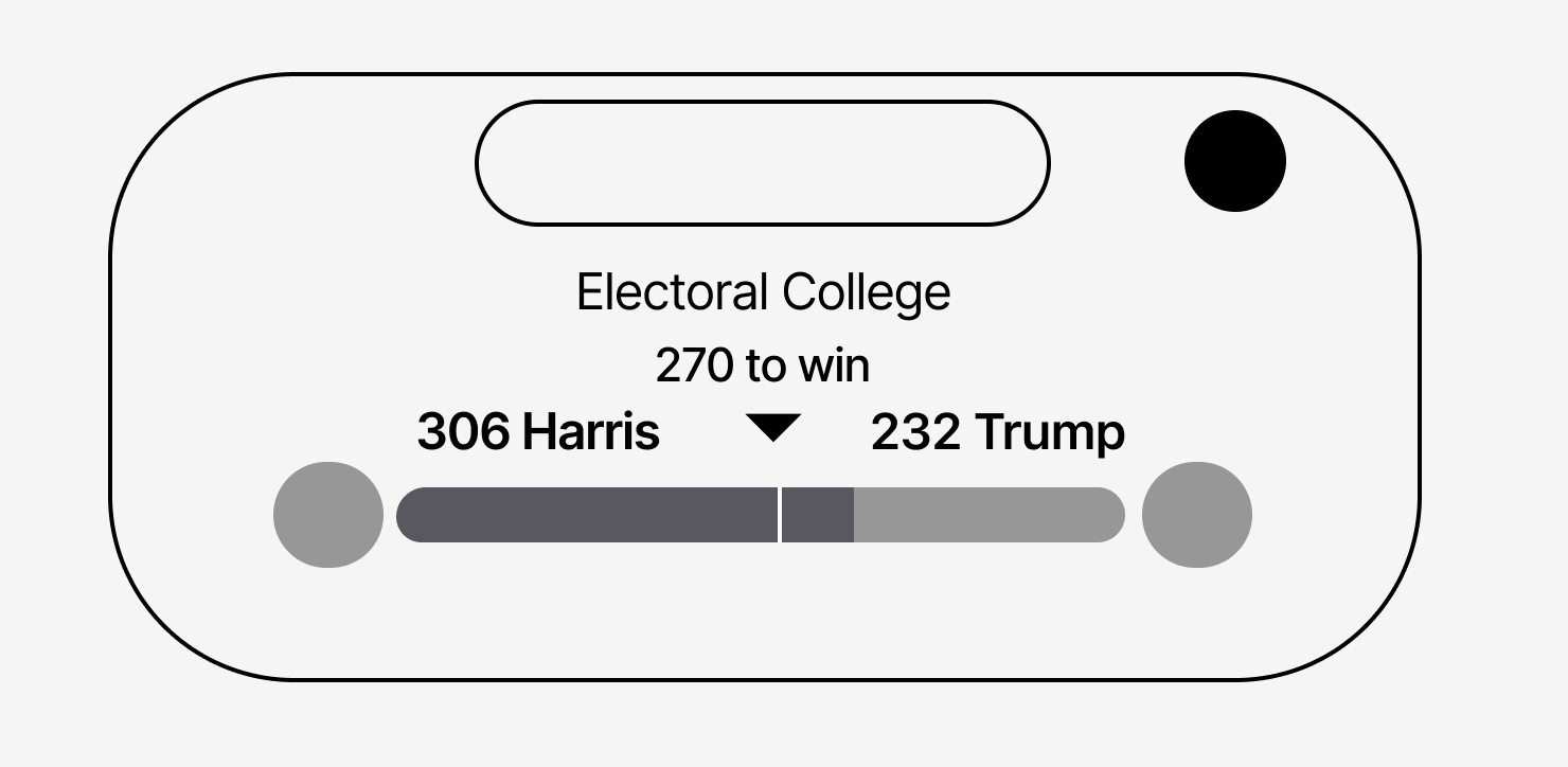
Two Dynamic Island states: Compact and Expanded. The Dynamic Island shifts based on whether the phone is locked, in use, or idle.
Compact shows the two candidates and their electoral vote counts, using portraits and party colors in the small pill format. Expanded pulls down into a full card with the "Electoral College — 270 to win" header, portraits, and vote counts at larger scale.
→ Design Strategy
A modular widget system across three iOS-native surfaces, paced to the arc of election night.
→ Lock Screen
A full-width Lock Screen widget with the Electoral College at the top and a state-level breakdown below. Candidate portraits, bold vote counts, party-colored bars, and a "270 to win" marker in the middle. Last-updated timestamp anchored to the top right.
Below the bar: state-level context. "PA Votes: 25% Harris, 24.5% Trump. 45% of expected votes reported. Race has not yet been called."
Fast reads. Honest data. Clear when the race is still open.
→ Dynamic Island Compact
The smallest form. Two candidate portraits and their electoral vote counts, split around the pill. Party colors do the identification work. No labels, no timestamps. Just the score.
Designed to sit in the corner of your attention. If you want more, you tap.
→ Dynamic Island Expanded
Tapping the Compact pill expands into a full card. "Electoral College" and "270 to win" as the header. Candidate portraits at larger scale, split by party-color bars showing the current vote counts.
Everything the Compact state implies, made explicit.
→ State-Based Messaging
Clear language for every stage: "Polls closing." "Race has not yet been called." "Winner declared." Readers always know what they're looking at and how sure the data is.
→ Results
The widget shipped for election night. The numbers followed.
12K
Readers with the widget on their Lock Screen
25K
Widget opens
30K
Pageviews to the election results page
110K
Article pageviews in the app on Election Day — the Inquirer's highest single-article count of 2024
104K / 71K / 43K
All-time highest monthly, weekly, and daily app sessions — all set on November 6
→ Reflection
Designing for uncertainty
Election night is a story about incomplete information. The widget had to communicate what was known, what was still counting, and what hadn't happened yet, without ever overstating any of it. Designing for that kind of ambiguity is a different muscle than designing for a finished state.
Building for the format
The Lock Screen and Dynamic Island are not smaller screens. They are their own medium. The widgets that worked treated them that way. The ones that didn't treated them as compressed versions of a webpage.