DANAË
Brand Identity — A Fictional Gold Jewelry House
→ Overview
A house built on one myth and one metal.
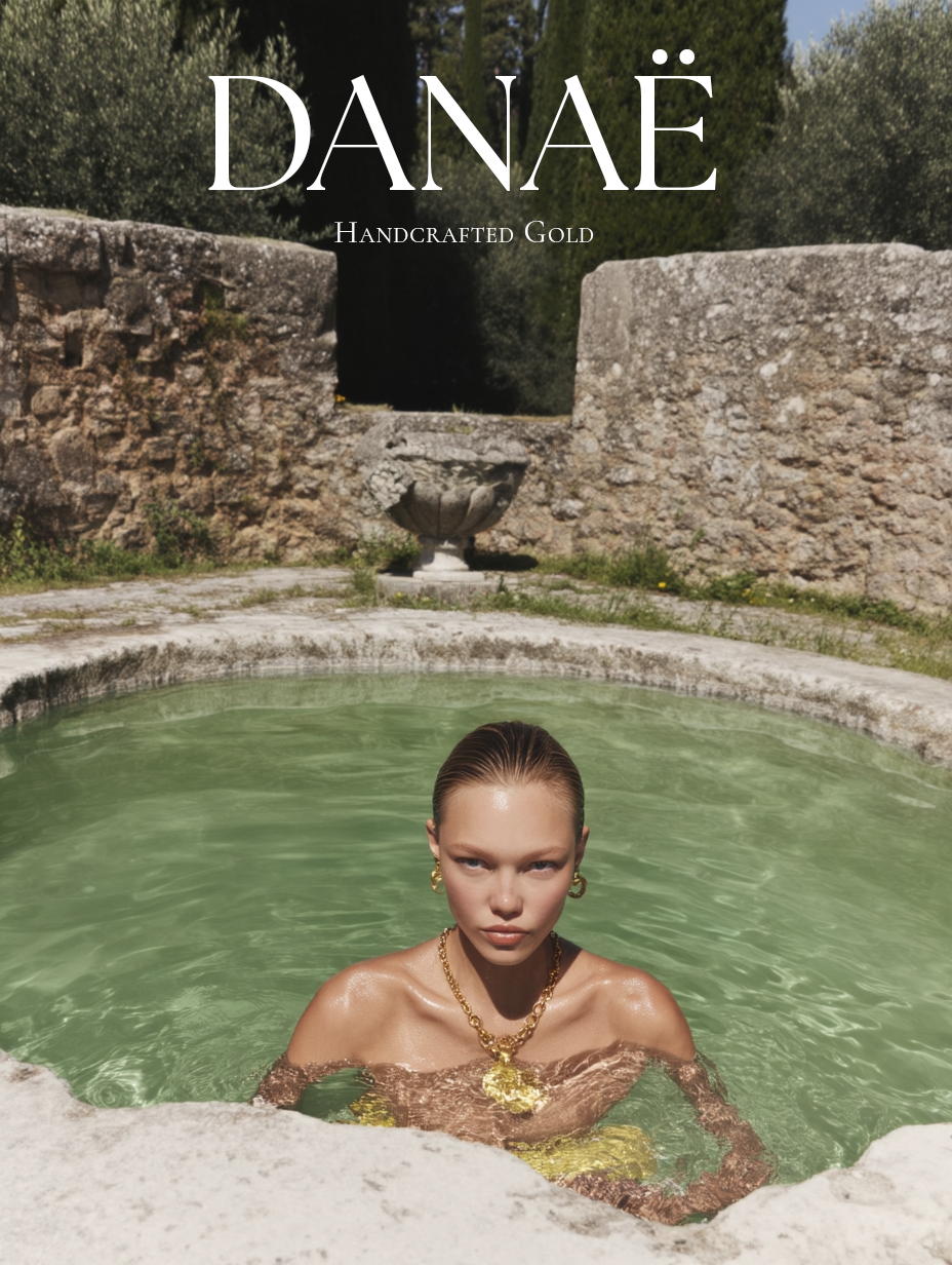
DANAË is a self-directed brand identity for a fictional gold jewelry house. A complete visual system built from scratch: a logo, wordmark, typography, color, and campaign art direction, drawn from the Greek myth of its namesake.
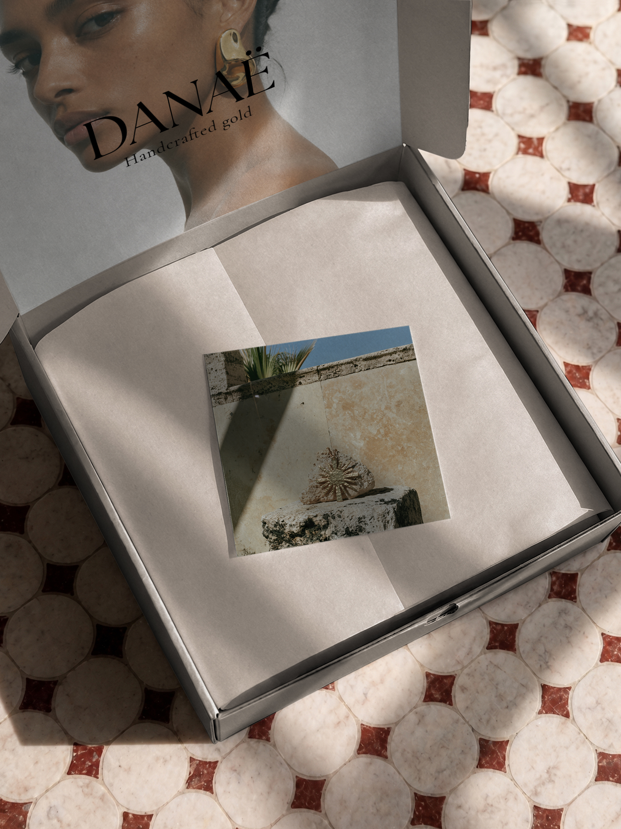
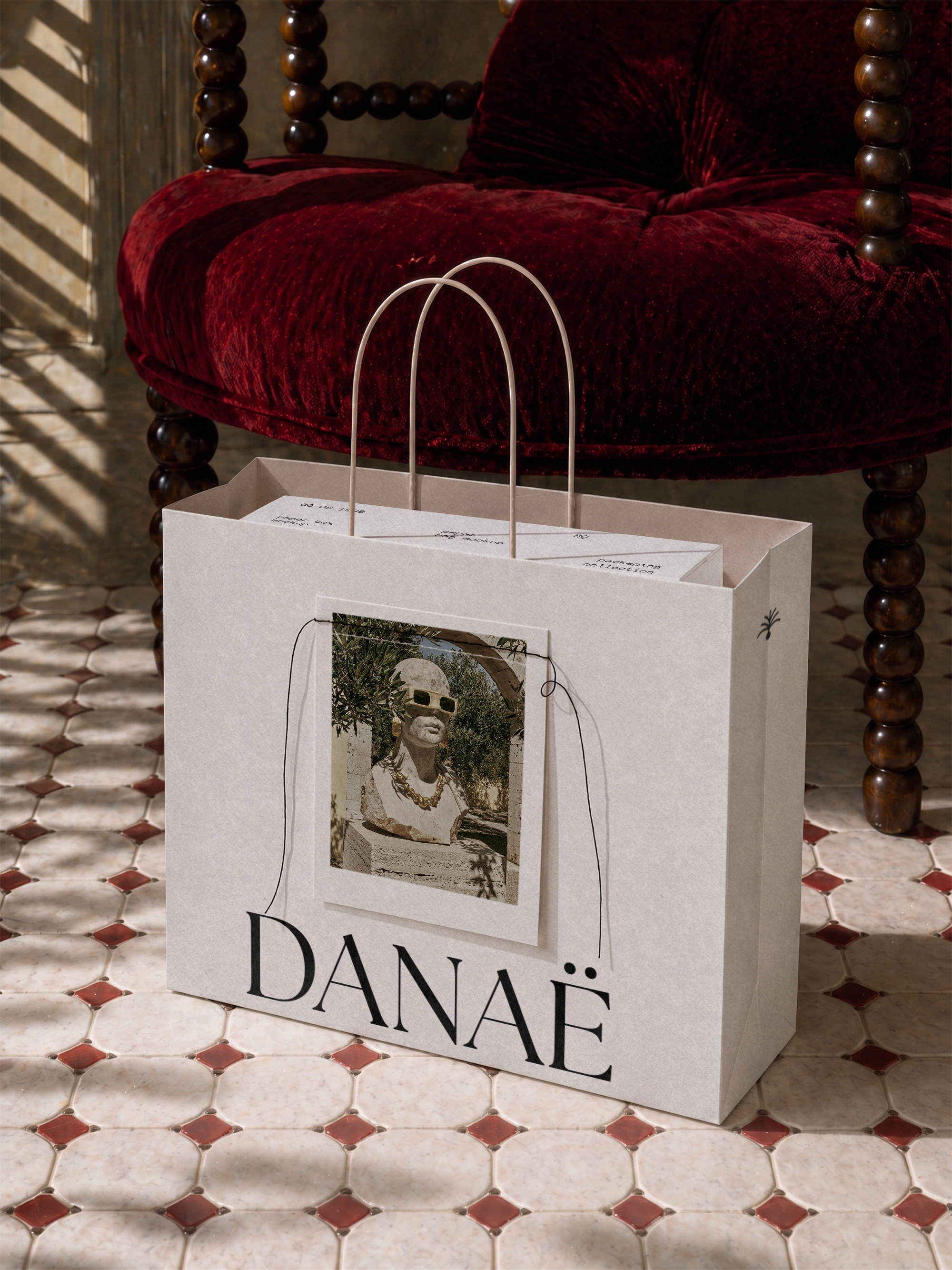
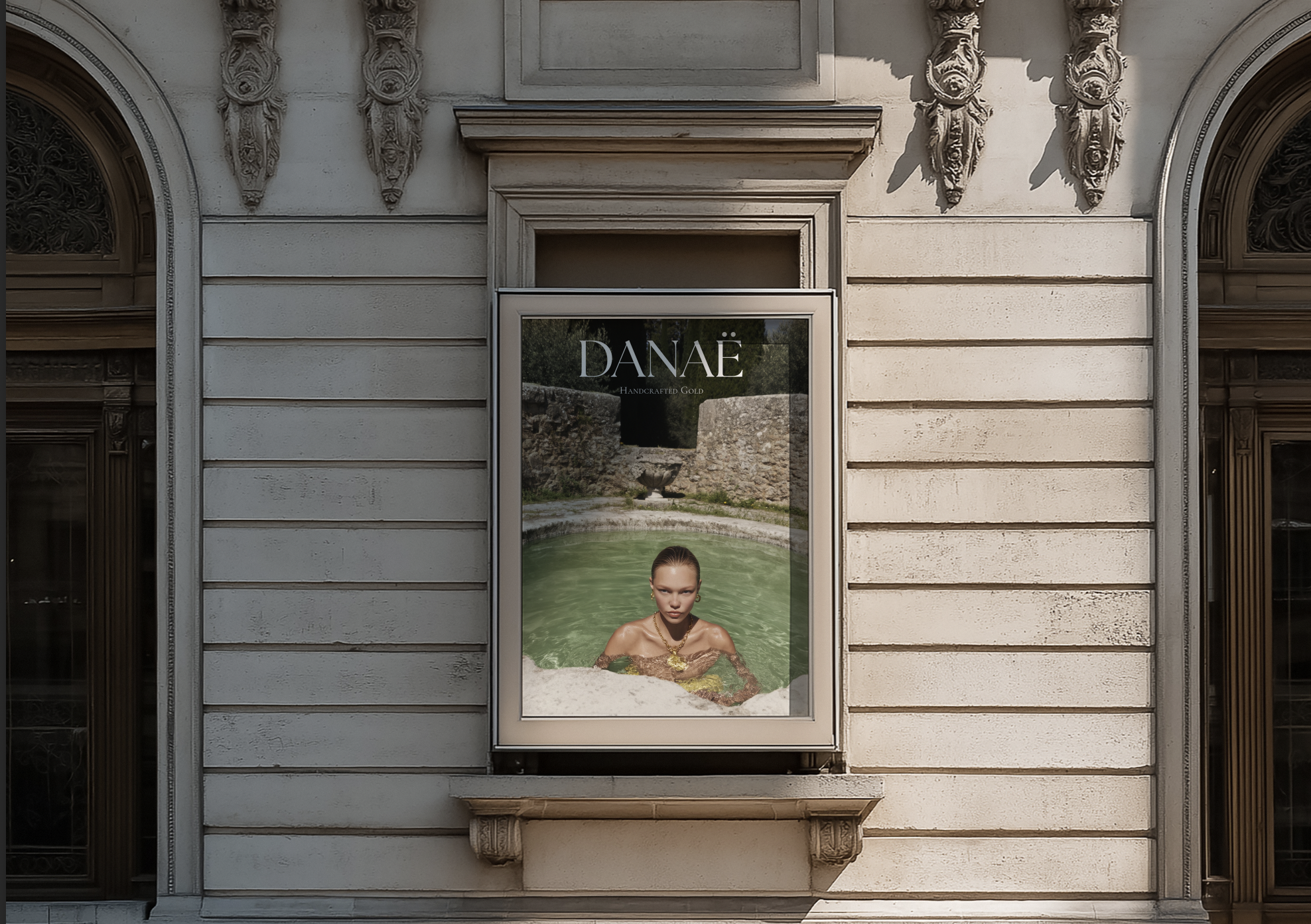
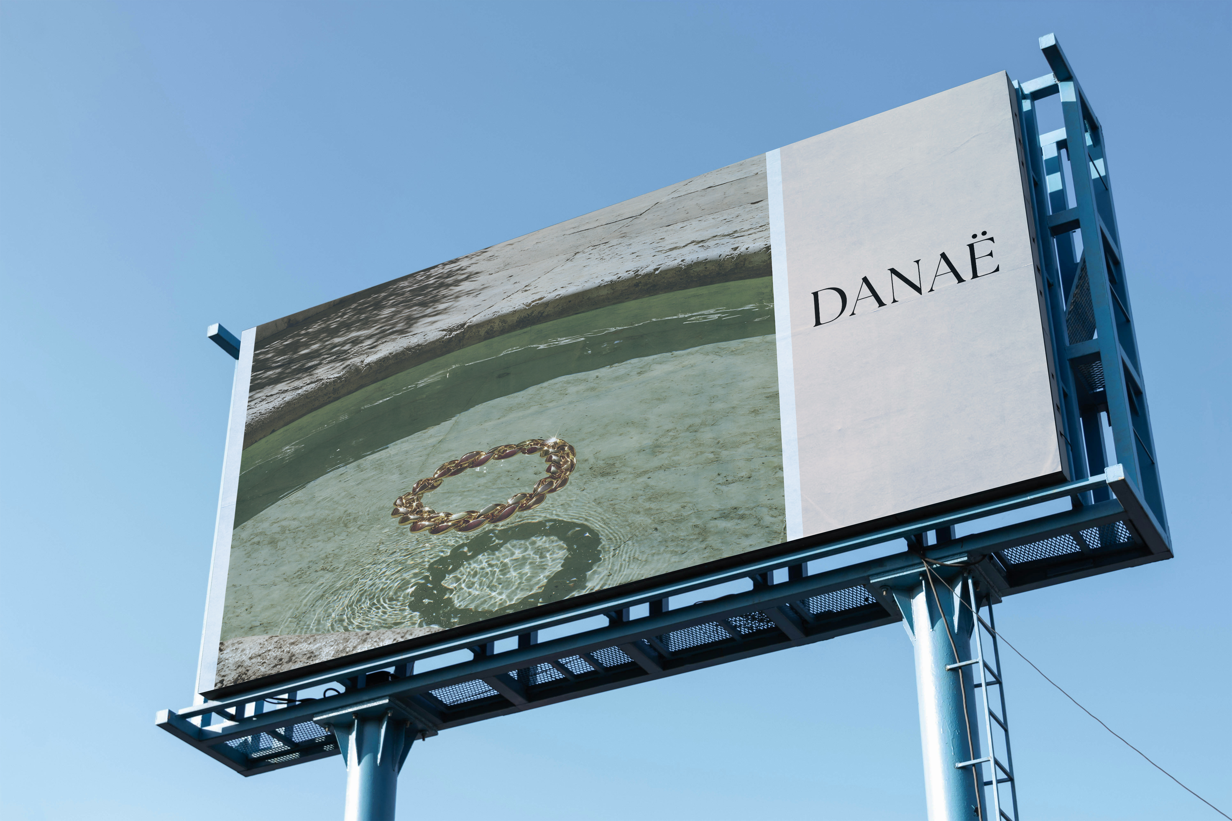
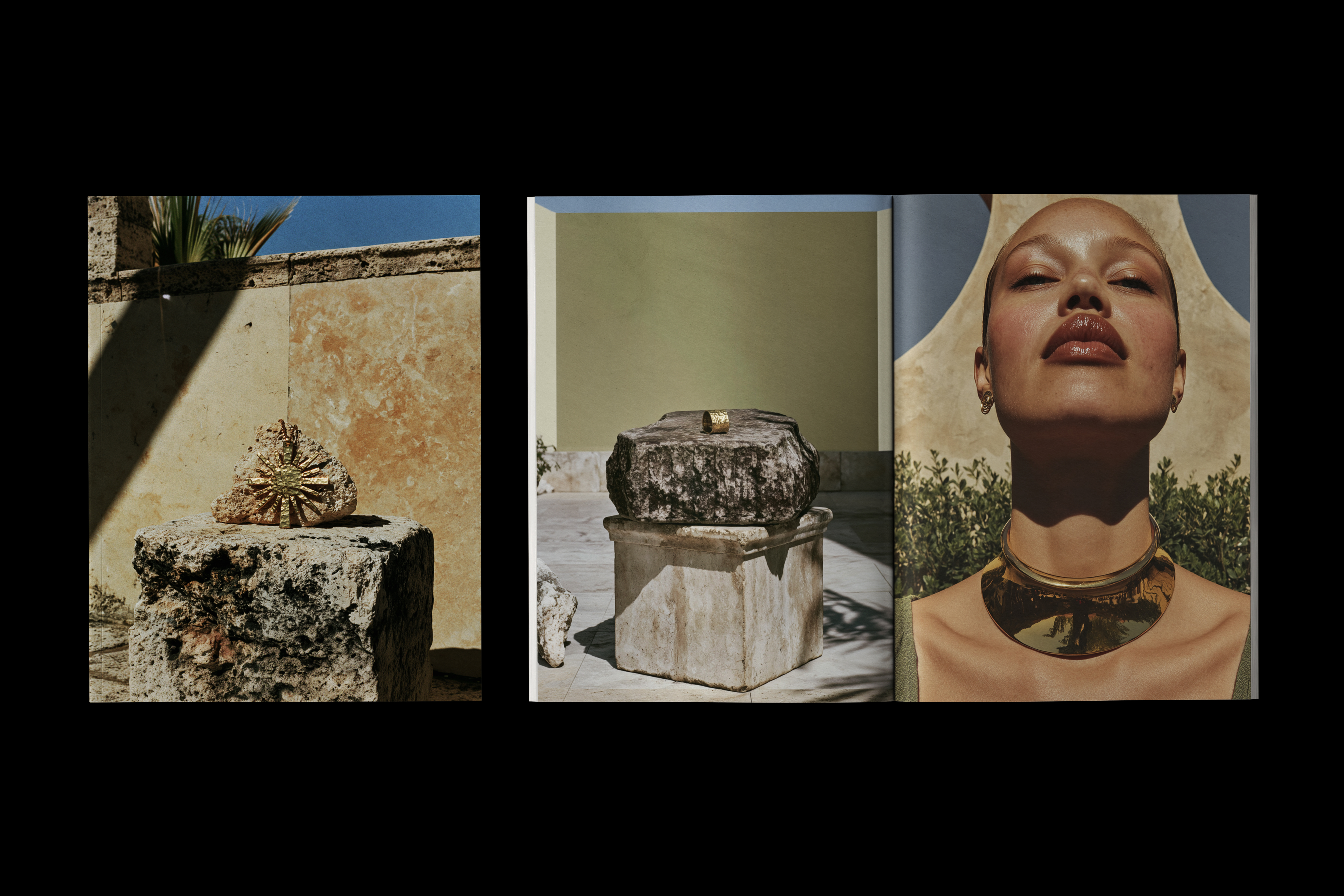
Editorial imagery and applications extend the concept into a cohesive brand world, one built to hold up across packaging, campaign, and digital.
Identity
Danaë was shut inside a bronze tower to keep every suitor out, and visited by Zeus anyway, as a shower of gold. The identity begins with that image: gold as something warm, radiant, and inevitable, a thing that finds its way in. From there it reaches back into the sun-and-stone Mediterranean the myth belongs to.
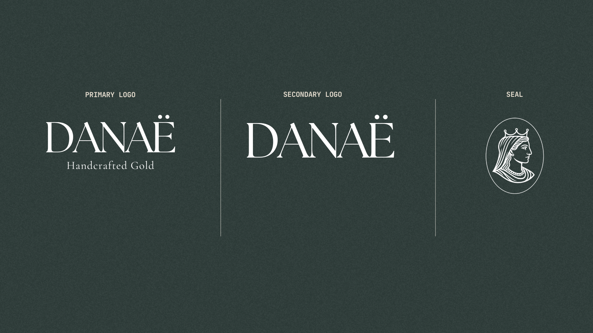
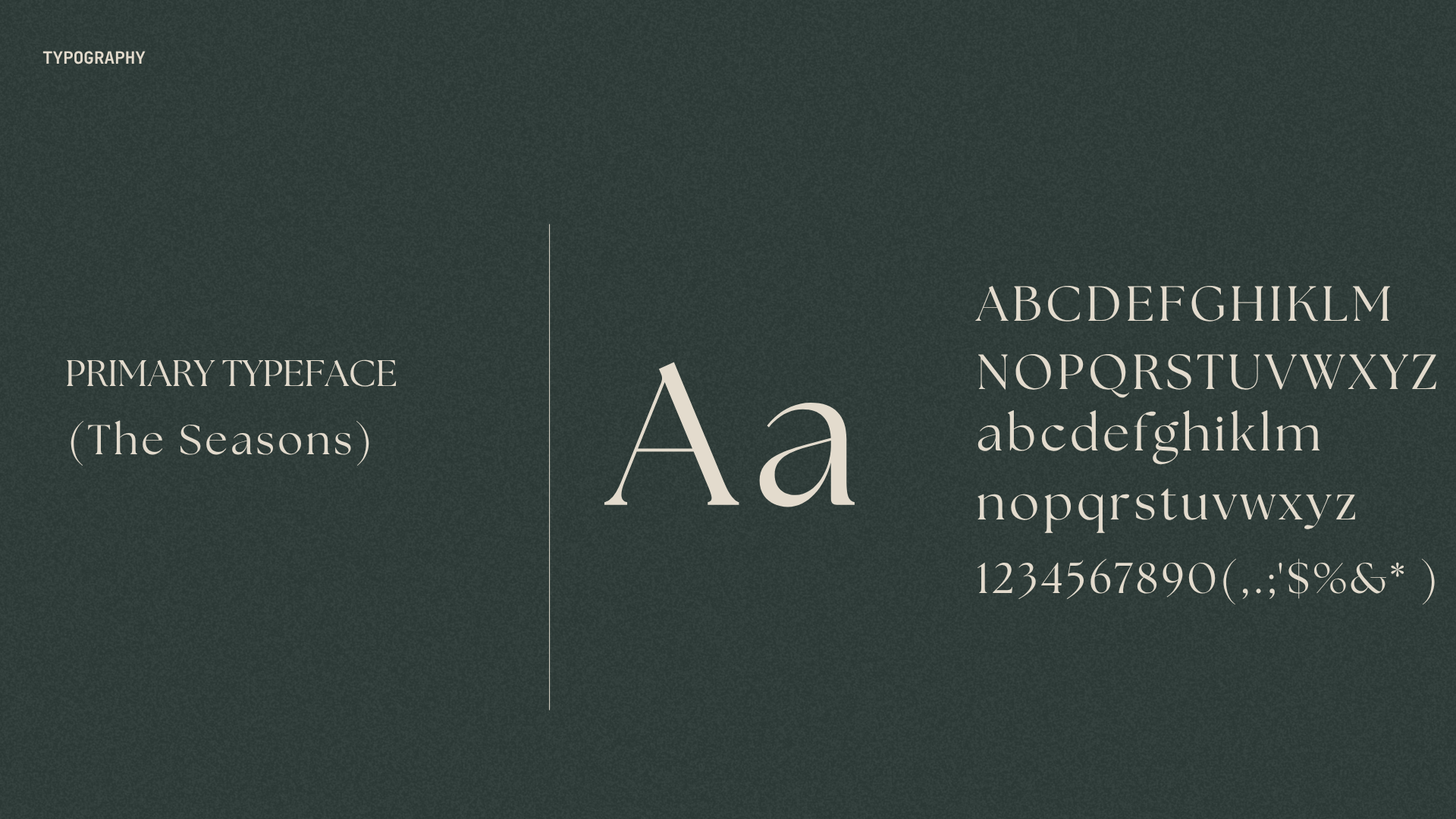
The wordmark is set in The Seasons, a high-contrast serif with wide, unhurried proportions, the diaeresis over the Ë kept as its one deliberate flourish. A line-drawn seal, Danaë crowned in profile, carries the name where the full logotype can't: a clasp, a stamp, a wax closure. Everything else in the system stays quiet so the mark can hold the name.
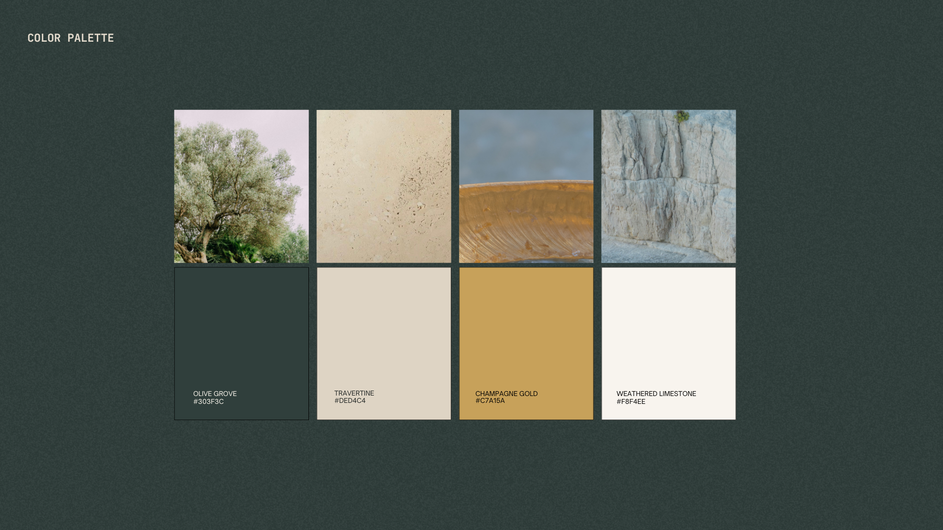
The palette is drawn from the landscape rather than a swatch book: champagne gold against deep olive grove green, travertine, and weathered limestone. No gradient stands in for the metal. Every surface in the system, gold included, is photographed rather than rendered, so it catches light the way the real material does.
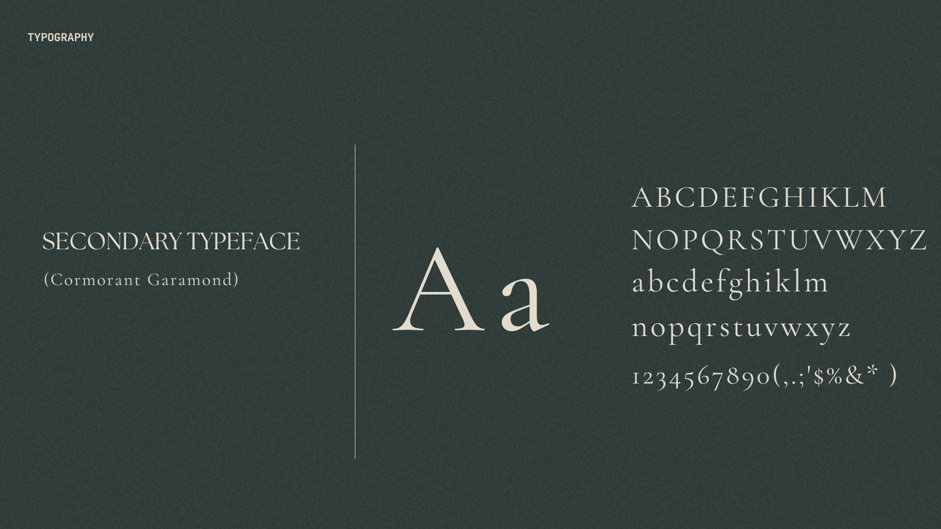
Supporting copy sits in Cormorant Garamond, a classical serif set small and generously spaced, a quiet nod to inscription and engraving rather than screen type.
Applications
Digital
Desktop (click to play)
Mobile (click to play)