Sacred
Femininity
Museo di Aurelia
→ Overview
Marble, flowers, and one very serious serif.
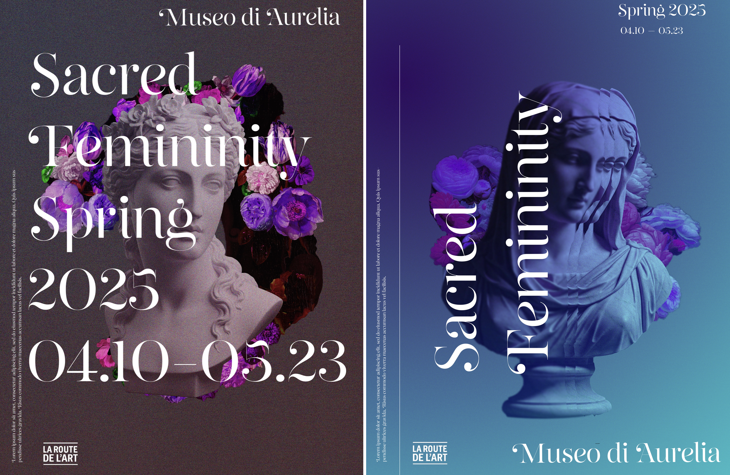
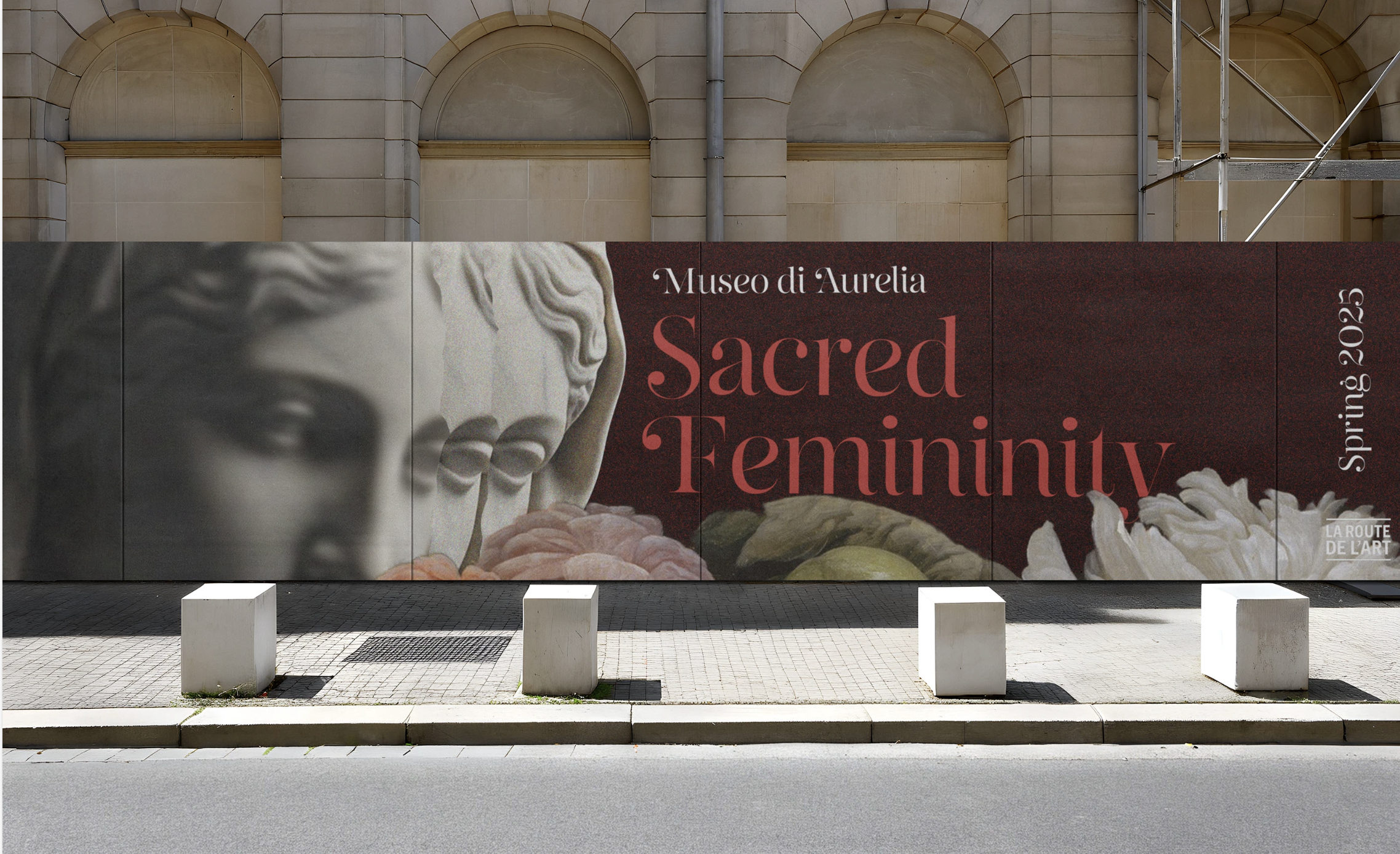
Sacred Femininity is a self-directed brand identity for Museo di Aurelia — a mock museum exhibition of iconic paintings and sculptures depicting women from religious and spiritual history.
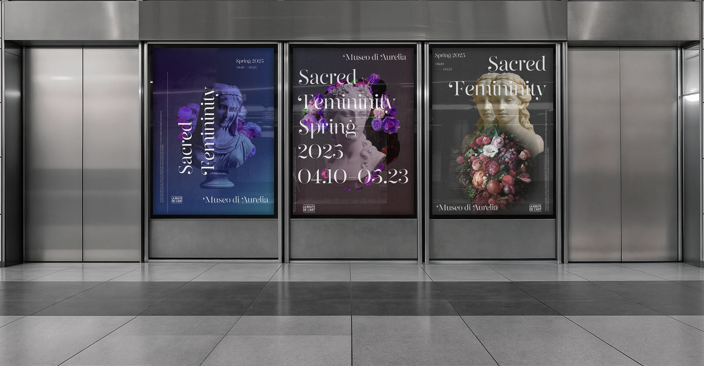
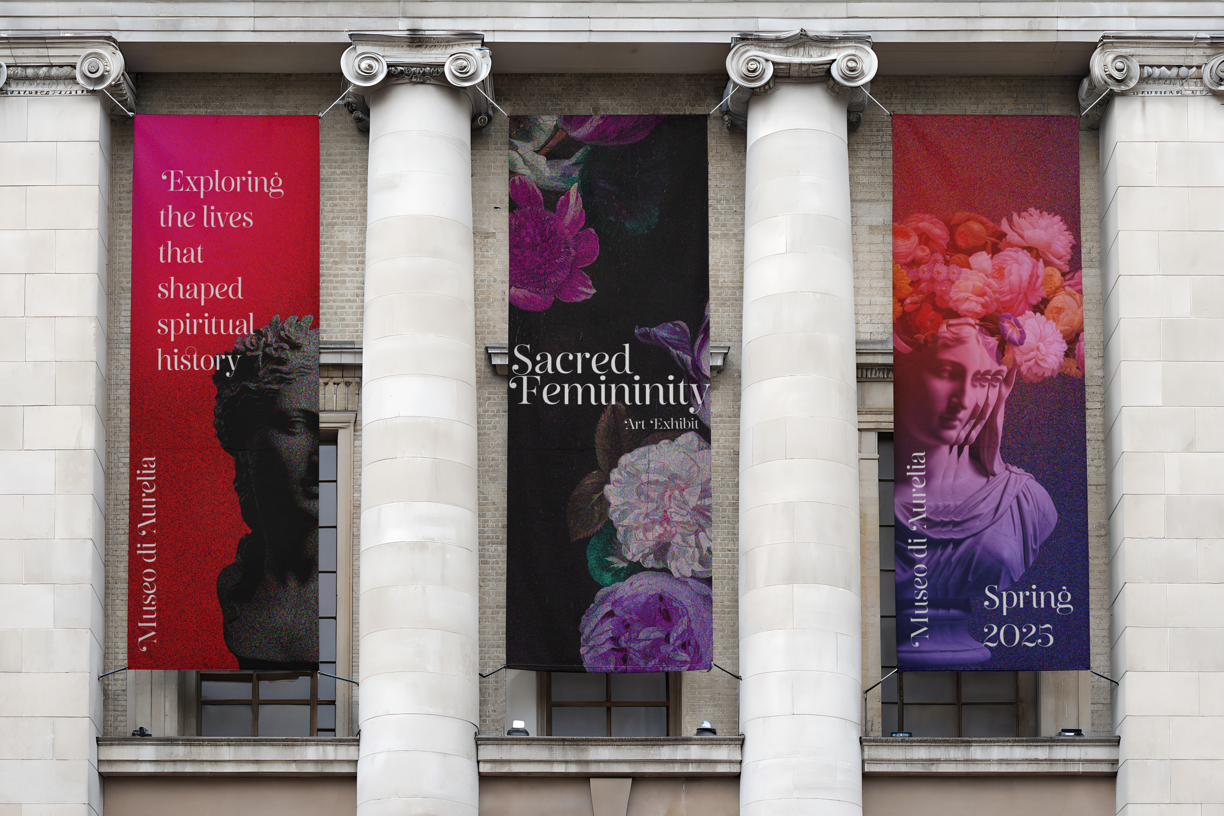
A cohesive system built from scratch, applied across large-format environmental graphics, signage, and print collateral, and stress-tested at exhibition scale without losing the emotional weight of the source material.
Identity
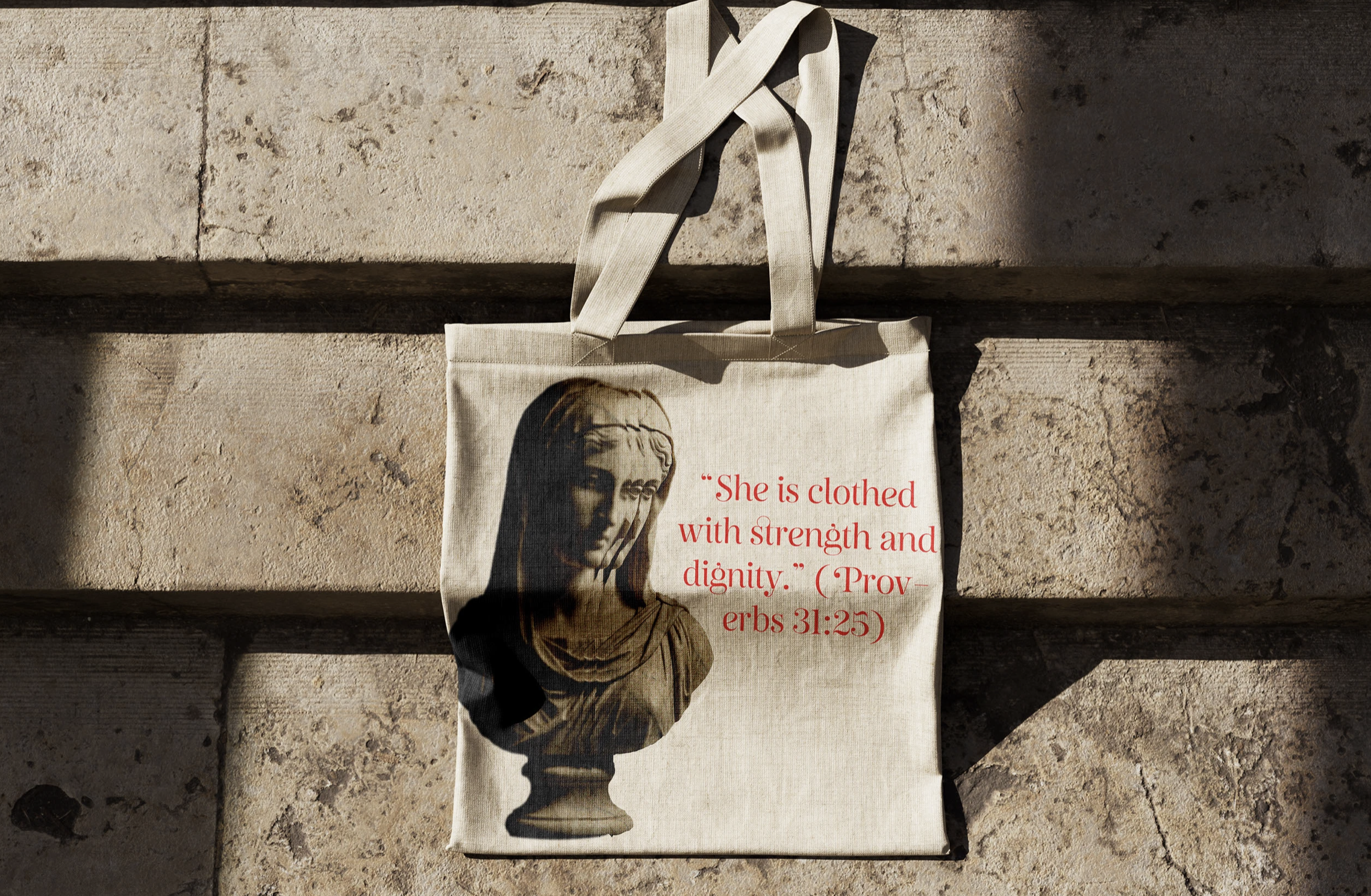
The identity borrows from devotional art. Gilded edges, chiseled letterforms, deep pigment. All of it pulled forward to exhibition scale.
The wordmark is a high-contrast display serif with room to breathe. Elongated ligatures, generous spacing. Formality without ornament.
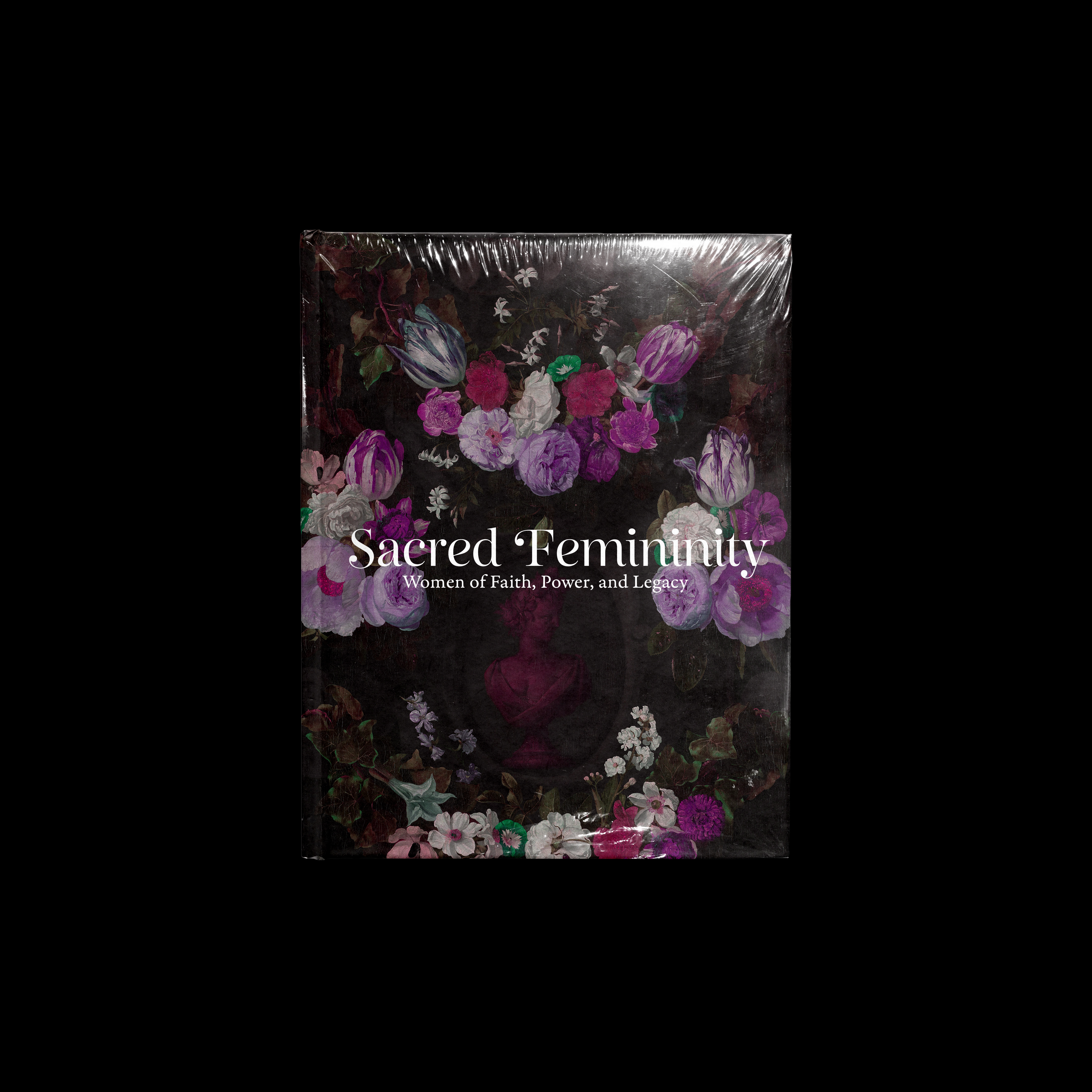
The palette moves through deep oxblood, dusty rose, midnight indigo, and dark aubergine. Colors pulled from the source paintings rather than layered on top. One color often takes an entire application, letting the sculpture and floral imagery do the tonal work.
Applied across signage, print collateral, and digital. The mood shifts application by application while staying unmistakably Aurelia.
Applications