Taste Philly
with Craig LaBan
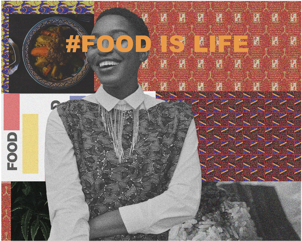
→ Overview
Most food newsletters hand you a list. This one hands you a syllabus.
Taste Philly with Craig LaBan is a six-week, course-style newsletter built around the city's food scene and hosted by the Inquirer's own restaurant critic. Not a digest of where to eat this weekend — a guided series you enroll in, move through week by week, and stay with.
The goal was engagement you feel part of, not just an open rate.
→ The Problem
The newsletter delivered the news. It didn't build a relationship.
Traditional Inquirer newsletters did their job: timely, reliable, informative. But they were one-directional. No local texture, no participation, no reason to feel like a member of anything.
The Inquirer needed a format that could deepen the reader relationship — build loyalty, invite participation, and open a credible path to sponsorship revenue — without giving up editorial authority. The bet: content this specific to Philadelphia, in a voice this trusted, would earn attention a standard newsletter never could.
→ Comparative Analysis
Reference: L.A. Times "Unshaken" ↗
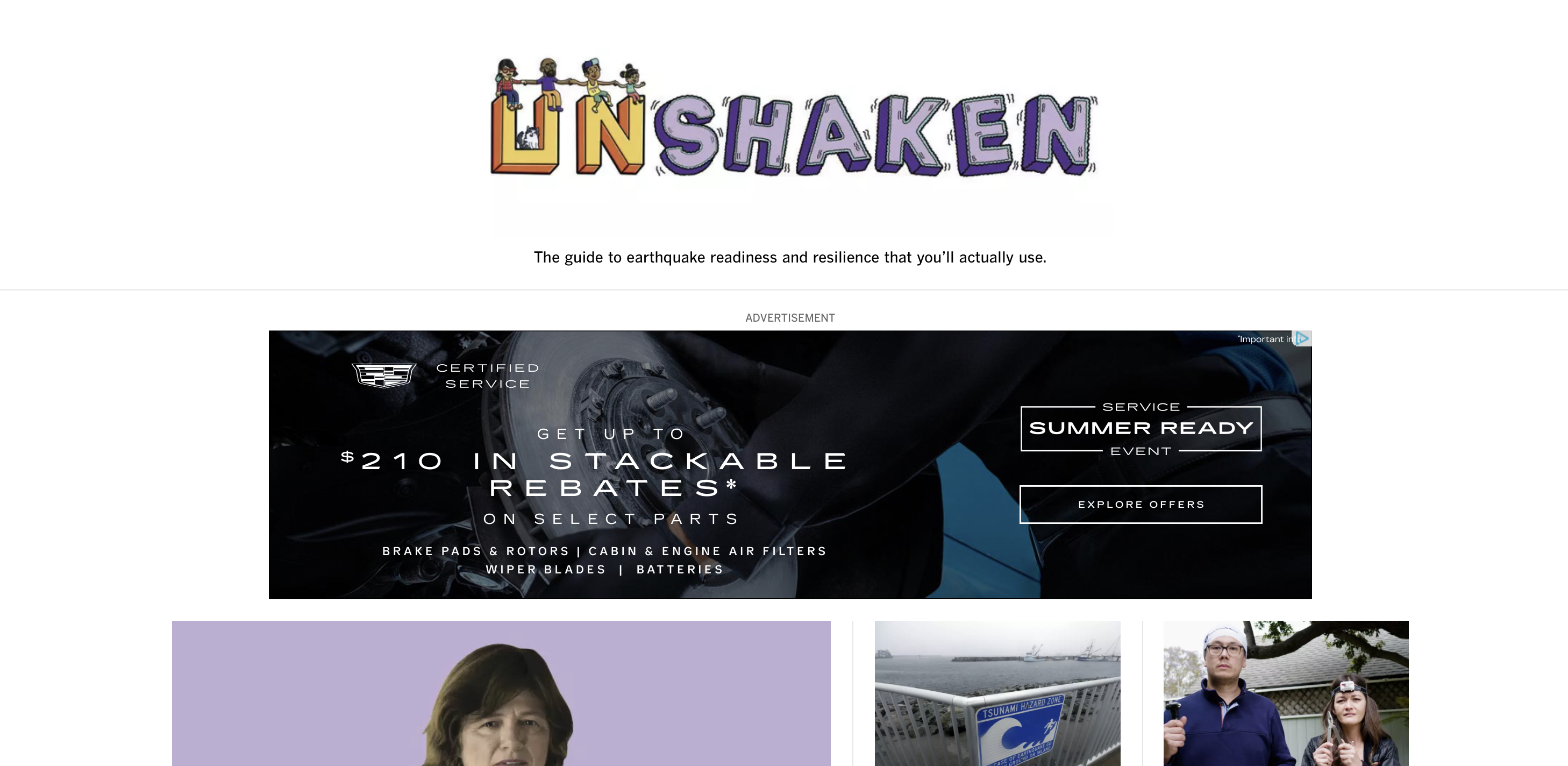
I studied the L.A. Times' course-style newsletter to understand why the format works. Unshaken runs as a structured, multi-week series with a clean, uncluttered layout, strong editorial photography, and interactive beats — quizzes, polls — that turn passive readers into participants. It proves the course model can carry a newsletter and keep people moving through it across weeks.
The opportunity wasn't to fix it. It was to give it a hometown and a host.
Unshaken is format-forward but voice-neutral. Taste Philly could take the same proven structure and fuse it with two things it didn't have: a single, authoritative local voice in Craig LaBan, and a visual identity that reads unmistakably as Philadelphia.
The starting point: keep the course architecture, make it feel like it could only come from here.
→ Explorations
Two threads: a visual identity that tastes like Philadelphia, and a layout that reads like a course.
→ Visual Identity


The first direction was minimalist — generous white space, bright accents, and editorial food photography doing the heavy lifting. I presented it to stakeholders with a clear rationale: let the imagery carry the appetite, keep the frame quiet.
Stakeholders liked the restraint but pushed on color. The palette needed to sit closer to LaBan's brand and to the warmth of Philly's food culture — less neutral gallery, more hometown table. I explored new palettes to find the balance: keep the clean structure and the white space, but warm the accents so the identity felt specific rather than default.
That tension — restraint versus warmth — set the tone for the whole system.
→ Format
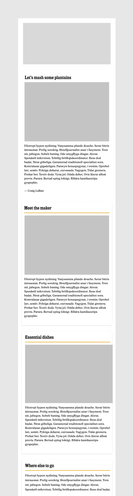
The second thread was structure. A course has to feel navigable: clear sections, an obvious sense of where you are in the series, and a rhythm that rewards reading top to bottom. I designed a cleanly sectioned layout with high-quality, editorial-style photography tied to each week's content — and made mobile the priority, since most readers would open this on a phone and clarity had to hold at that size.
→ Design Strategy
A minimalist, course-style layout warmed by a Philadelphia-specific palette, carried by LaBan's voice, and designed mobile-first — structured to support interactive beats as the series grew.
→ A Palette That Reads as Philly
The final identity kept the white space and simplicity that landed early, warmed by a color palette tuned to both LaBan's brand and the city's food culture. Approachable, but with the authority of a critic behind it. Clean without reading as generic.
→ A Layout That Reads as a Course
Clean sections, an intuitive reading order, and bright editorial photography that made each week feel like its own chapter. The structure carried the educational feel without ever reading like homework — welcoming top to bottom, consistent across devices.
→ Built for Participation
The layout was designed to hold interactive elements — polls, links, and other dynamic beats — so the series could grow from a reading experience into a participatory one. The scaffolding was there for engagement to build on as the course ran.
→ Results
The highest click-through rate we'd ever sent.
→ Reflection
A voice is a design decision
The format was proven before I touched it. What made Taste Philly land was pairing it with a specific person and a specific place. Designing around LaBan's authority — and Philadelphia's identity — did more for engagement than any single layout choice.
The work was in the middle of the palette
The color exploration wasn't decoration. Getting from "clean and neutral" to "clean and unmistakably Philly" was the actual job — and it happened through rounds of stakeholder feedback, not a single stroke of taste. The best version lived in the tension between restraint and warmth.