Weekend
Story Stack
→ Overview
Every weekend, the Inquirer publishes 5–7 themed franchise stories.
Deeply reported, richly photographed, meant to be lingered over. But each one lived in isolation — readers clicked one piece and left.
Weekend Story Stack stitches those articles into a single, scroll-native browsable experience — a magazine-like format that gives readers a reason to stay.
→ The Problem
Recirculation was essentially nonexistent.
5–7
Franchise stories published every weekend
0
Connective tissue between them
1
Story read per visit, then readers left
→ Comparative Analysis
Reference: NYT "The Lives They Lived" ↗
An annual New York Times package memorializing notable people who died that year. Each subject gets a full essay. The essays are stitched into one long scroll. No separate pages, no click-through between pieces.
One of the few examples of the scroll-native, multi-story format done at scale. Proves the concept works. Readers stay in a stacked collection and move through more than one piece in a session.
But there's a critical flaw. Once you're deep in the page, three or four essays down, there's no way back to the top except scrolling through everything you've already read. No jump nav, no story index, no shortcuts.
That was the starting point. Keep what works. Fix what doesn't.
→ Explorations
Two threads: how readers move between stories, and how the stories themselves are laid out.
→ Navigation
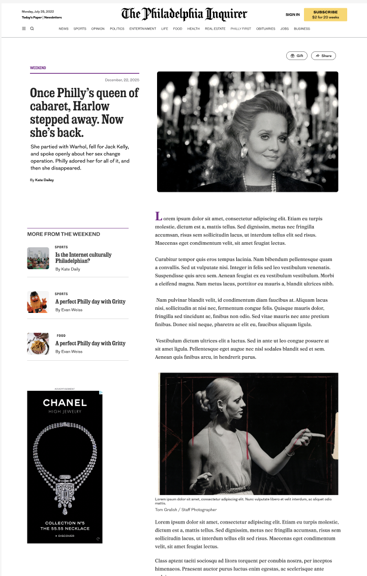
More from the Weekend sidebar — persistent, but loud
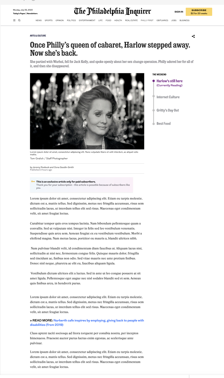
The Weekend table of contents — Currently Reading state
Two CTAs. A "More from the Weekend" sidebar with thumbnail links — persistent, but loud. Competed with the reading.
Then "The Weekend" table of contents on the right, marking the current story as "Currently Reading." Quieter, more legible. Became the foundation for the final sticky nav.
→ Format
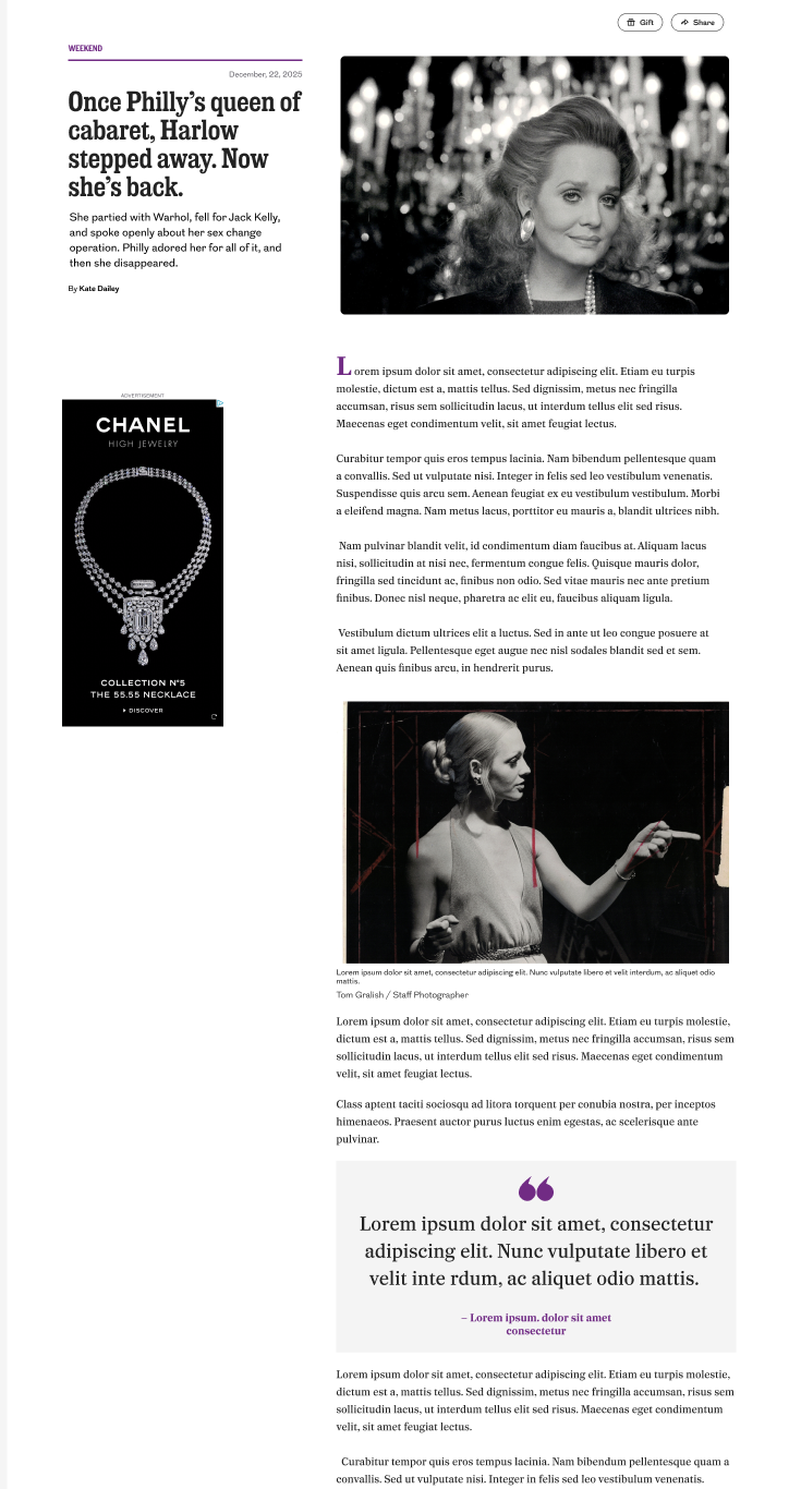
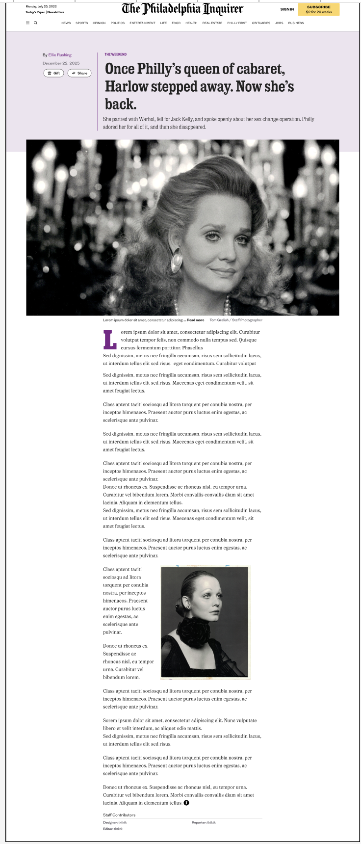
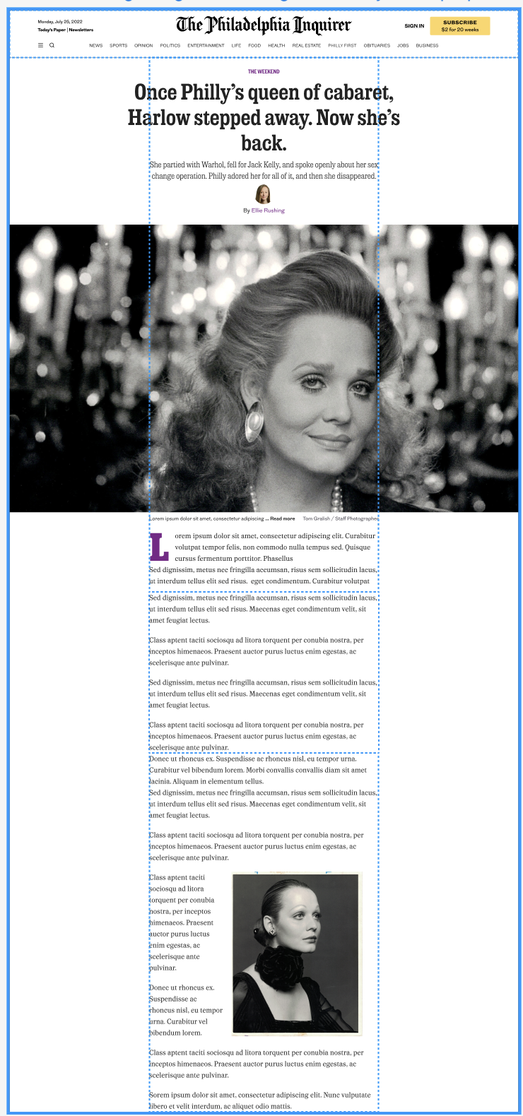
Three layouts. Two-column with headline and metadata on the left, body on the right. Full-width single column with a large hero up top. And an editorial version leaning on pull quotes and visual breaks for rhythm.
Each one clarified how much structure the template needed to feel cohesive without overwhelming the writing.
→ Design Strategy
A two-column layout with a sticky hero, a lightweight nav bar that knows when to appear, and a truncation system that keeps every article shareable on its own.
→ Two-Column Layout
The hero image stays sticky on the left. The article text scrolls on the right. Each story gets a strong visual anchor and a clear sense of place. You always know which story you're in, even deep into the page.
On mobile, the layout collapses to a single column. The reading experience stays the same.
→ Weekend Reads Nav Bar
A persistent but lightweight way to move between stories. Shows the next article in the collection. Expands into a full dropdown of the set.
Desktop: sits just above the article text. Mobile: sticks to the top of the screen.
Disappears while you're deep in an article, so it doesn't compete with reading. Reappears as you near the end. Present when you need it, gone when you don't.
→ First Full, Rest Truncated
The first article loads in full. Every article after it is truncated to a headline, image, and enough of the lede to decide if it's worth continuing.
Clicking "read more" expands the article in place and rewrites the URL. Readers can share any individual story without leaving the experience.
Magazine feel, without sacrificing individual article shareability or tracking.
→ Usability Testing
3 rounds.
25 participants.
Mobile-heavy sample, because that's how most Inquirer readers read. Each session ran 10–15 minutes with an interactive prototype covering the subnav, sticky image module, multiple article types, read more, and ad placements.
→ What We Found
Subnav was learnable
Got mixed first reads — some saw links, some saw headlines. But when asked to use it, most people figured it out quickly. Less confusion on mobile than desktop. A good signal for a mobile-first design.
Article boundaries were clear
Users understood where one story ended and the next began. The visual rhythm of the two-column layout did the work without needing explicit labels.
→ Results
The isolated-article format was the problem.
The stack is the fix.
→ Reflection
Scroll-native navigation
The subnav's disappear/reappear behavior proved that navigation doesn't have to be always-on — it just has to be there at the right moment.
Benchmarking to improve
Using the NYT format as a reference wasn't about copying it. It was about identifying exactly where it broke down, and designing the fix.